Case Study: Havey Twitch Branding
- Audrey Stemen

- Mar 12, 2021
- 4 min read

The Ask
Branding is not just for construction companies or realtors, it's for everyone – especially gamers.
Whether everyone knows it or not, we all have our own personal brand. Some may say, our "personality." But for Justin Havey, gamer, video editor, and photographer, this was his newly-launched Twitch gaming channel's only chance to get a little darker, edgier, mysterious with a little symbolism, but totally badass.
You only get one first impression – and we wanted to make it a damn good (and unique) one.
In the Fall of 2019, Justin and I talked for a few months about what his branding meant to him, and especially how that would live on a live-streaming platform like Twitch. Viewers and their attention to a streamer's branding has only grown over time, along with an appreciation for it as an art form. With all of that in mind, I wanted to be very intentional with the brand and the symbolism behind it.
The Deliverables
- A header banner
- Logo
- "Offline" screen
- "Be right back" screen
- Panels
- Live camera overlay

The Inspiration
🦉Justin has always had a fondness for owls – their cunning personalities, stealth, intense beauty, not to mention their subtlety in being dangerous.
🟠And then there's the color orange – its just his favorite. But I also thought having orange be act as some kind of beacon and warm ember-ish feeling among a dark, colder atmosphere would be a great contrast.
🔺But, what's with the triangles? There's a bit of a rabbit hole there, but essentially, it is the most balanced of shapes. Total equilibrium. Peace, chaos, and everything in between. Two sides can't be complete without the third.
(Not to mention the fun fact that he is also one of three brothers, and they all have three triangles tattooed on their bodies – one triangle being filled in to indicate their lineage of the three. Pretty cool.)
There's also the ask for some "cool" elements to compliment the compositions – glass shards, some ambient darkness, san serif typography... the rest is history.
The Ideas
I always start with lists.
A list of adjectives, wants/needs for the project, deliverables, lists of assets I need to execute my vision – even lists for different kinds of approaches I want to try before narrowing in on one. I start with words, then approach it visually.
(On the right, you'll see different ideas for looks and what potential styleframes could come of them. Stone, light rays, gradients, metal? Rock? Frosted glass? Everything is on the table at this point.
On the left, you see some of my "lists" for various elements that could be used in some compositions, like effects, typography, and animation.)

At this point, that's where the good ole classic sketchbook and pencil/pen comes into play.

I started to play with compositions that could essentially be the main header banner – because that was the deliverable that takes up the most space. Thought it would be great to use that for a styleframe exploration.
Different views of the owl, its demeanor, or even just the subtle hint of it was being tossed around here. I wanted to do something that would be a little confrontational and disruptive.
The Experiment Styleframes
This is always my favorite part. Putting ideas to pixels and seeing what works and what doesn't.
There was a lot of evolution from my very first pass at this (which cringes me to look at to this day 😅) to where it ended up – and I agree with the sentiment that it's not always about the destination, but the journey. I don't feel like I would've ended up where I did with the brand if it was for getting those bad first passes out of the way.
Very First Pass (with some animation)
Second Pass - Drastically different in tone, much closer to final vision
Quite the difference, eh? It's great to see how your mind can change after making something, stepping away from it, and just approaching it differently.
I think what also made such a difference, was my experience in using textures & faking effects was gaining some momentum, and I was able to do more with less.
The Outcome
Before Justin officially launched, we also did a little bit of social media teaser-countdown material. I took some of the main elements of the branding and applied some basic animation for an easy daily countdown.
Then, the launch itself.
We didn't totally know what kind of response (if any) was going to be seen on the first couple of livestreams. I don't know the exact numbers, but about every time Justin went live playing video games or live-editing photos, there were at least 2-5 people making a mention about the stream's brand quality... which, in my mind, is a pretty cool metric to see. I think he was well on his way to 150-200 subscribers in the first few months. To me, it validated that brands with more intention and quality don't go unnoticed.

There was a point made a while back that although people don't tend to follow/subscribe to others for their branding, it makes a larger impact when it is higher quality – it shows that people really care about their visual presence.
Hangin' With Havey
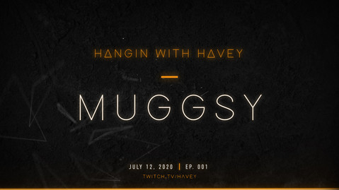
Fasting forward to mid-2020, Justin was working on putting together a gaming-related podcast called Hangin with Havey, where he would bring on special guests in the gaming scene and talk about... well, gaming. His very first episode hosted a former pro-Halo player, handle name "Muggsy," and went very well! From what I hear, the podcast among other things will be up and running again soon.
It was a great way to expand his branding into other contexts, and I'm sure there will be more to come.
I thought this project was beyond fun and had its own set of challenges, that I'll soon be applying to my own stream branding! Know of anyone looking to brand/rebrand for their stream setup? Let me know ;)
⚡️👋🏼🍻


Comments